Showing posts with label data visualization. Show all posts

Sunday, August 12, 2007

A graph is worth 1,000 words

This weekend has been kind of fun. First, the anti-evolution blogs jumped all over the hominid study that was in Nature. And, then when they were challenged by scientists to clarify why they thought this was a 'hit' against evolution....well, they couldn't. Some mostly good discussions ensued from there of a more philosophical bent (which I enjoy). See more coverage and links here, here, and here.

And, in a strikingly similar fashion, the global-warming-is-a-hoax crowd* has been having an orgy over the announcement of an error in temperature data from the NASA GISS lab. All of the sudden, the basis for global warming has been completely shattered! I'm not gonna go into the details here; you can get more information here and here (and updated more here). And just for kicks, check out the numskulls on this blog....yikes.

What I do want to point out is that Tamino over at Open Mind has yet again boiled all the hub-bub down to its essence (by the way, Open Mind one of the best climate science blogs out there). Please follow that comment thread if you want to get into the nitty gritty.

Here, he plots the temperature data before the correction (in red squares) with the now corrected data (open diamonds).
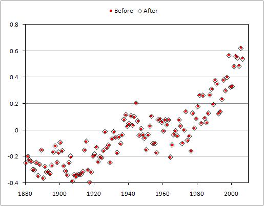

Alrighty then.

------------------------------

UPDATE: This is just too good to not mention. I'm not sure why I did it....maybe I was bored, but I went onto the blog I mention above (the numskulls) and got into some back-and-forth commenting. I was being civil (at least compared to the tone of the rest of the commenters), and I simply pointed them to Tamino's graph and asked them why the error and its correction is proof that global warming theory is all of the sudden invalid. I got a response that didn't address the data or my question; it was a ranting non sequitur (and I even tried to pre-emptively discourage non sequiturs to focus the discussion). Then I was called a "leftist". Good argument. And then, finally, the blog owner removed my comments. If you go down to the comments numbered in the mid 80s or so, you'll see my comments clipped with a snarky response, but the actual full comment was removed. But, I just hit refresh and some other comments were further manipulated....so, who knows.

People can do whatever the hell they want on their blogs. But, if you say this...

Comments are welcome, even those that contradict the main post. However, comments may be deleted for profanity, racism, threats, harassment, spam, or if they are deemed inappropriate.
...and then delete them anyway, you're completely misrepresenting yourself. I guess my comments were deemed "inappropriate" because they challenged their narrow-minded view. Plus, i'm sure the blog owner didn't want that pesky link to a graph for his followers to see....they might be educated and leave his blog. Go on over to this post at Deltoid to see "The Ace" in action (starting around comment #110 or so)....very entertaining!


--------------------------
*I've said it before, and i'll say it again. The mixture of the evidence for warming, attribution, and policy in this global discussion is unfortunate. I do think that the real debate to be having now is what should we do and how should we do it (i.e., policy). But, the denialists continue to muddle that serious debate with nonsense about the scientific basis, claims of conspiracy, or simply their hatred for Al Gore. When having discussions with people I always try and "tag" each aspect into (1) data; the measurements, (2) attribution; the cause, and (3) policy; what to do about it. I found this clears up the mud significantly in serious discussions and causes nonsensical and emotional partisan arguments to be revealed rather quickly.

Wednesday, August 08, 2007

Visual relation-based search engine for books

It seems more and more when I am looking for a book or a review of a book I end up on a page that links to Amazon. I can't remember exactly how I found this site (amaznode), but it's a way to search through Amazon's catalog visually.

The way it works is that it connects books through the 'customers who bought this also bought this' data. It's kind of interesting.
For example, in the screenshot image above I put in 'Patagonia geology' into the search box and the book cover thumbnail images started popping up. Another moment later, connections denoted by lines were drawn. This image is a snapshot in the process...it kept going until it filled in the entire Amazon catalog that satisfied the search terms.

The main group of books near the top are a bunch of travel and trekking books. The group to the right is a bunch of Patagonia fly fishing books, and the third major group near the bottom of the image represents a group of South American cookbooks. I'm not sure where the geology search term comes in here....hmmm.

And then you can move your cursor over the thumbnail and the book title pops up. If you click on it, a little box pops up from which you can go to the regular Amazon page or say 'put in cart' and keep going.

This style of searching and the visual revealing of links is becoming more abundant on the web. I'm not sure it's robust enough (yet) to replace any searching methods, but it is an interesting additional way to find things. Especially, when you are curious about how the different books are linked. I would guess those researching marketing trends might find this very interesting.

It's fun. Try it.

Friday, July 06, 2007

Spectacular visualization of flight patterns

If you haven't seen by now...i'm a sucker for images showing complex patterns. I found a fantastic website that is part data visualization and part art. The author/artist of this project, Aaron Koblin, compiled flight pattern data from the FAA for the United States (and most of North America) and created stunning images and animations. The animations are really the coolest part of this...to see our flight transportation system like this is jaw-dropping. It looks like the flurry of activity you see on an ant hill...or something.

Here are a few of the images....check out the site for more.


The look and feel of the work reminds of the Cabspotting project that I posted about several months ago.

Wednesday, July 04, 2007

Global socio-economic cartograms

As an Earth scientist I live and breath maps.

I recently came across the site Worldmapper, which has nearly 400 global cartograms of various metrics. A cartogram is basically a map that shows area re-sized according to the variable being mapped. Worldmapper metrics include things like immigration, wealth, resources, housing, health, disease, education, and many others.

For example, below is a map showing the global distribution of scientific research for 2001 (defined as the number of published scientific papers by authors living in that nation). Further analysis would obviously require the raw data (which you can get off this site as well), but viewing the results in a map form like this conveys a lot of information immediately. The United States, Europe, and Japan (that dark purple blog on the right) stand out as "big" areas while areas like Africa, Central America, and Southeast Asia are "small".


Another example shown below is a cartogram of crude petroleum exports. Note the big players: the Middle East, Venezuela, Mexico, Norway, and parts of Africa. Nations where imports exceed exports (e.g., the United States) are not shown.

Wednesday, May 23, 2007

Visualizing complex networks

I came across this interesting website, called Visual Complexity, that has a collection of images from various projects that aim to map and produce visualizations of complex networks. These include biological, computer systems, social networks, the web itself, and others.

The image below is a map of the blogosphere from here.

The value of these to me aren't so much in using them as a map....as in to navigate the blogosphere with the above image....but to appreciate the nature of networks.