High-resolution sea-floor image offshore San Diego
Just a quick post today to show you one of the latest multibeam bathymetric images released by the US Geological Survey. Go to this page to view and download the large-format PDFs.
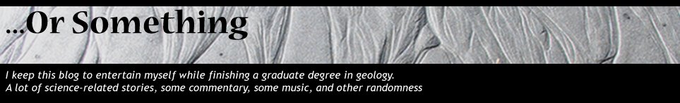
If you'd like to know more about the technical details of the concept, design, and acquisition of multibeam sonar data, check out resources here and here. This one is definitely worth clicking on to see the high-res version. The densely populated onshore area to the right is San Diego, California. For a more regional context of southern California geologic provinces, check out this page. The San Andreas fault is 10s of km inland from this location, but subsidiary strike-slip faults dominate the tectonic fabric.
The major submarine canyon cutting into the narrow continental shelf is called La Jolla Canyon. The head of that canyon comes very close to the pier at Scripps Institute of Oceanography if any of you have been there. Note the transition from the deeply incised submarine canyon to a submarine channel system as you go into deeper water. Also note the meandering nature of the individual channel "threads" within the belt. This submarine channel eventually empties into the elongate San Diego Trough basin, which is off the image to the left and in even deeper water.
A paper that i'm a co-author on is coming out in Geology next month and deals with this canyon-channel system in more detail and its history over the last 40,000 years. I will post about that soon, so stay tuned.
The USGS page also has some great perspective views....here is the link again, check it out.

